Borrowed Colors
Scroll down for a lot of color.
This is my final newsletter about the origins of web colors.
As a separate Colorphilia project, I will be writing up the histories of all 140 original colorword, and hopefully putting it together into a book of some sort. Please let me know if you would be interested in that.
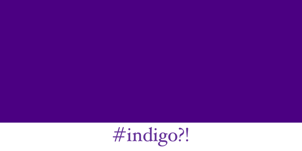
Over the past several weeks, I've been researching the origins of web colors. This rabbit-hole began when I was trying to figure out how indigo became a violet-hue, but the more I tried to understand how the colors and their names evolved, the more I realized is not understood about that evolution.
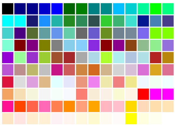
Last week, we saw that 15 of the 16 HTML colors were generated formulaically, based on the RGB (Red-Green-Blue) digital color format, and then those colors were assigned names that matched. This week, I've discovered that the majority of the other colors in the X11 color list were also generated formulaically, albeit based on the HLS (hue-lightness-saturation) color format, by the creators of the VT-240 color monitor around 1984.
You will see that that list is the near precise starting point of the X11 color list in August of 1985.
If this is the first time you are reading the Colorphilia Newsletter, welcome! Please consider a paid subscription to help support my research, or get a free subscription and consider giving a one-time tip. I could really use another gelato... for research purposes.
Have any color-related question or curiosity? Supporters with paid subscriptions may email me a question, and I'll research and write a 750-1500 word response.
As I noted last week, the only two early CSS colors which do not appear in the VT-240 list, the X11 list, or the HTML list are crimson and indigo.
Before I bore you with the details of how the X11 borrowed the entire list of colors from the VT-240, and how it too was generated somewhat formulaically, which means that colors preceded the color names, I'd like to make a note about the roughly 22 oddly named CSS colors, including everyone's favorite absurdity, Papaya Whip.
To quote the Indigo wikipedia page:
This collection of color names was somewhat arbitrary: Thomas used a box of 72 Crayola crayons as a standard, whereas Ravelling used color swabs from the now-defunct Sinclair Paints company, resulting in the color list for version X11 of the operating system containing fanciful color names such as "papaya whip", "blanched almond" and "peach puff". The database was also criticised for its many inconsistencies, such as "dark gray" being lighter than "gray", and for the color distribution being uneven, tending towards reds and greens at the expense of blues.
While it is possible that John C. Thomas used a box of Crayola crayons to figure out color shades and variations, it is unclear how that worked in reality, because there doesn't seem to be any connection or direct correlation between the names of Crayola crayons with any significant contribution of new color names to the collection.
Fanciful gelato, anyone?
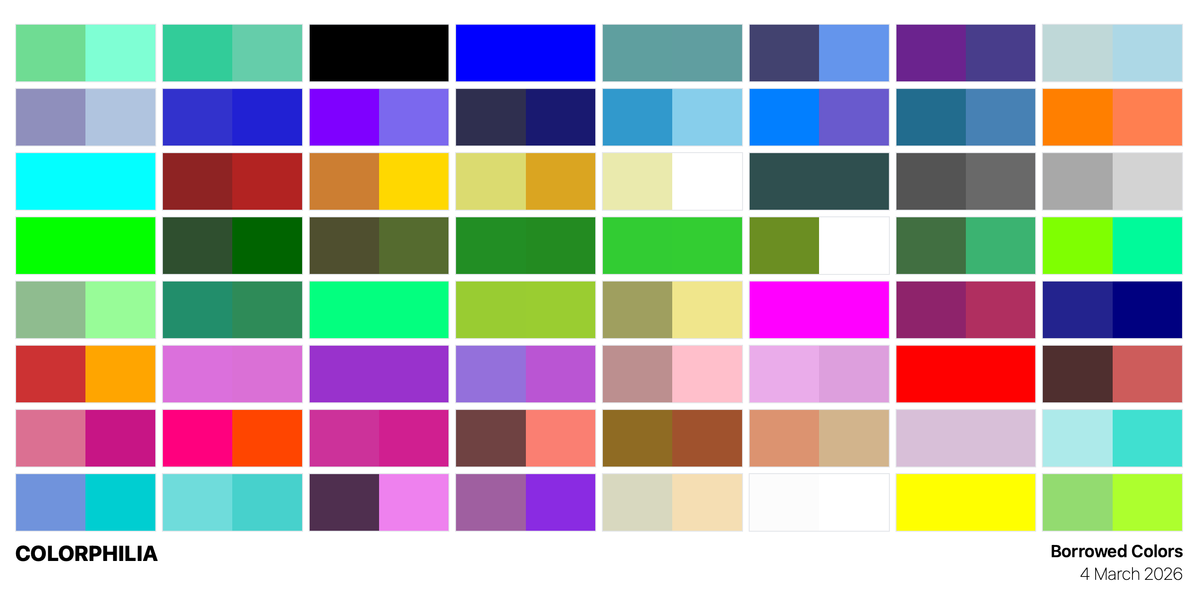
I found the color swatch page from the Sinclair Paint company which Ravelling used in selecting the most random names possible. It is a collection of 36 color swatches from their "Subtle Lights & Whites" line. The list he created using this resource was added on October 26, 1989.
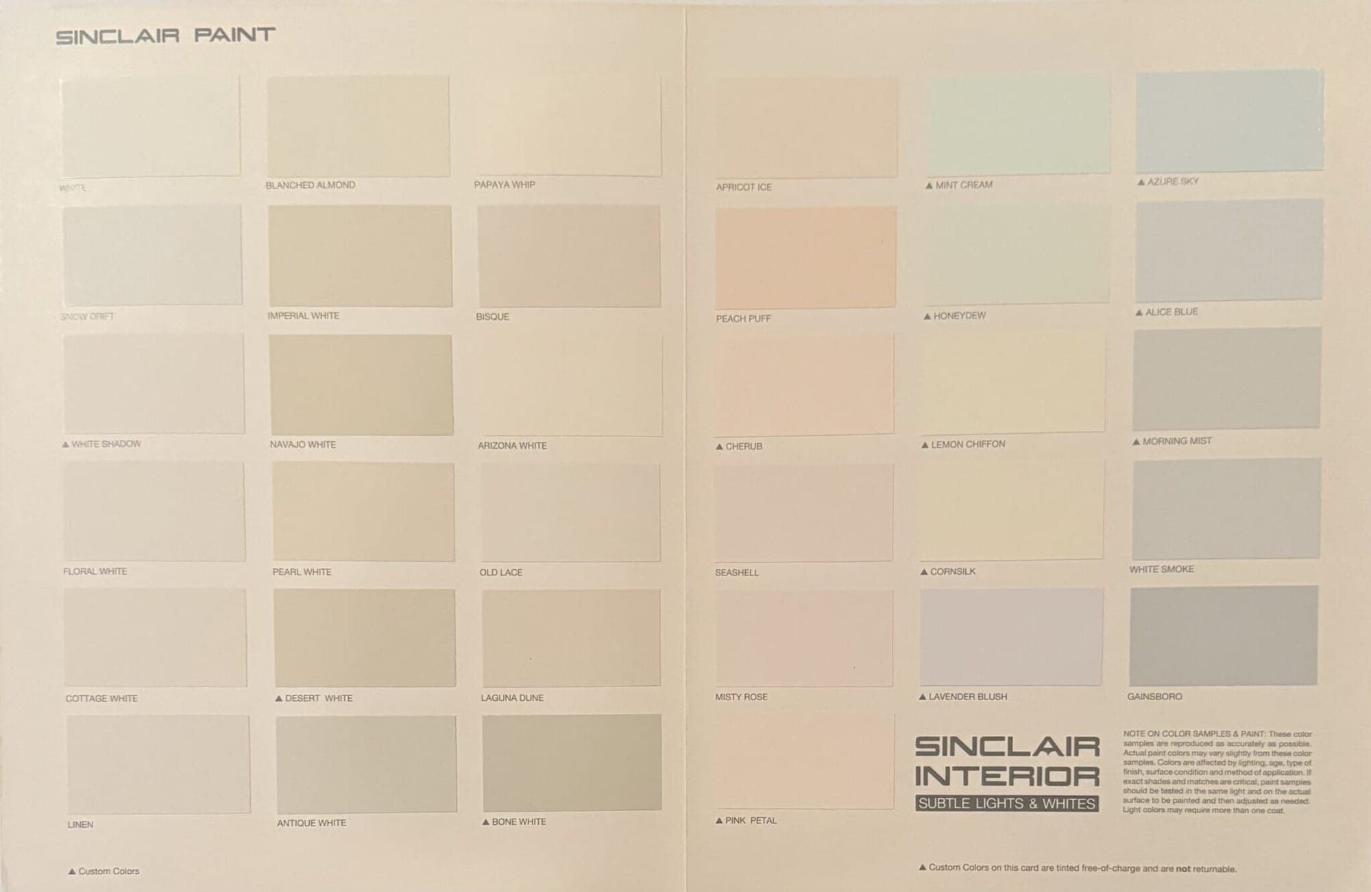
The notable thing about this addition is that Paul Ravelling apparently created the color combinations based on this list. As far as I know, he couldn't just take a digital photo of color or scan and use some sort of digital eyedropper to match the color. Even ignoring the choice of names, the only reason why these particular shades and hues are part of the codebase was because they were in this catalogue.
There is something beautifully human about this. The team who named the colors at Sinclair names on this list borrowed from diverse sources ranging from historical fashion (Alice Blue, Old Lace and Gainsboro) to ice cream (Lemon Chiffon, Papaya Whip, and Mint Cream).
Simply reading the list made my mouth water for a gelato.
What is somewhat odd is that moccasin was included in the shades he added during that tranche, but that name isn't on that specific catalogue page.
The reason for the fanciful color names was because interior paint companies always use fanciful color names.
Unwitting Lenders of Whimsy
A recurring theme in the origins of web colors is how people borrowed other people's work, without the original lender necessarily even realizing the extent.
Just like when Netscape borrowing SGI's color list, before making it open-source. That led SGI to have no idea that their color list would become the de facto palette of the web. Similarly, when Sinclair Interior compiled this particular line, they likely never imagined their whimsy (or intellectual property) would be enshrined forever in the code of millions of webpages.
Colorful Dodgers
The addition of "Dodger Blue" is also somewhat ironic. It was the only explicit shade referring to a sports team, and was added a year after the LA Dodgers won the World Series in 1988.
Borrowing the VT-240 List
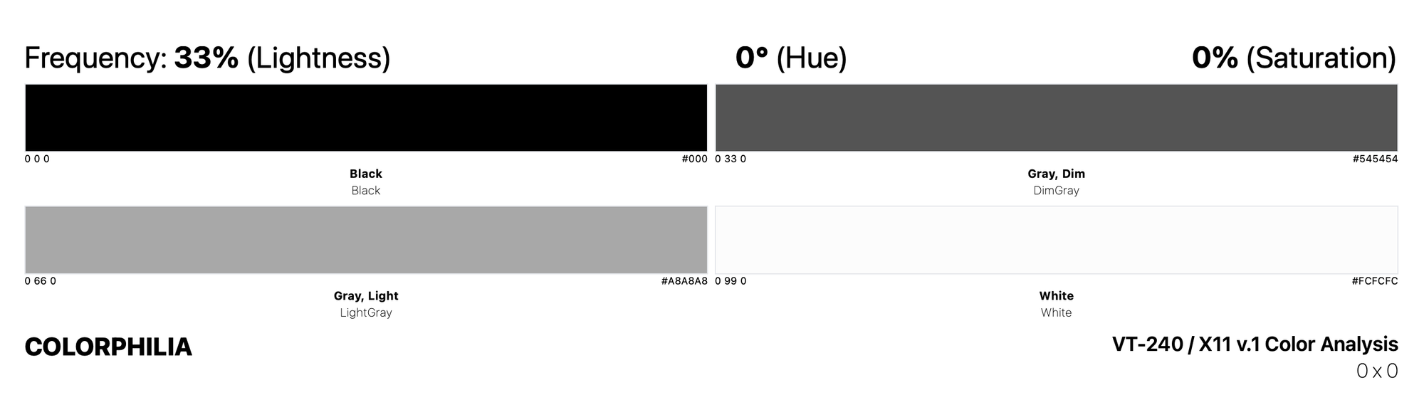
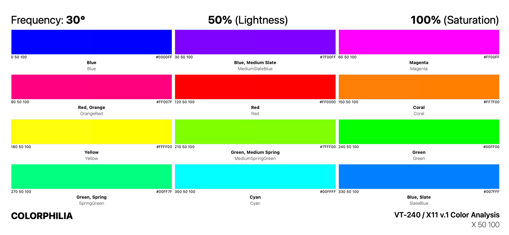
The first "commit" of the X11 list includes the same 64 unique color names which were on the VT-240 list. It should be noted that when we use HSL today, besides the different order of numbers, we usually consider red to be 0°.
However, in 1984, they considered blue to be 0°. They also didn't consider white to be 100% lightness, with no hue or saturation, rather, it was calculated as 99% lightness.
The biggest difference between RGB and HSL is that RGB colors described by the quantity of each of the three colors present (from 0 - 255), while the HSL spectrum is a full 360° collection of all the colors, with the addition of the different percentages of saturation and light.
After listing the colors, the creators of the VT-240 programmers' manual included this very important note:
The color names specified are only rough approximations of the specific shades. Actual color perception is affected by the intensity, quality, and adjustment of the display, external lighting, and your own color sense.
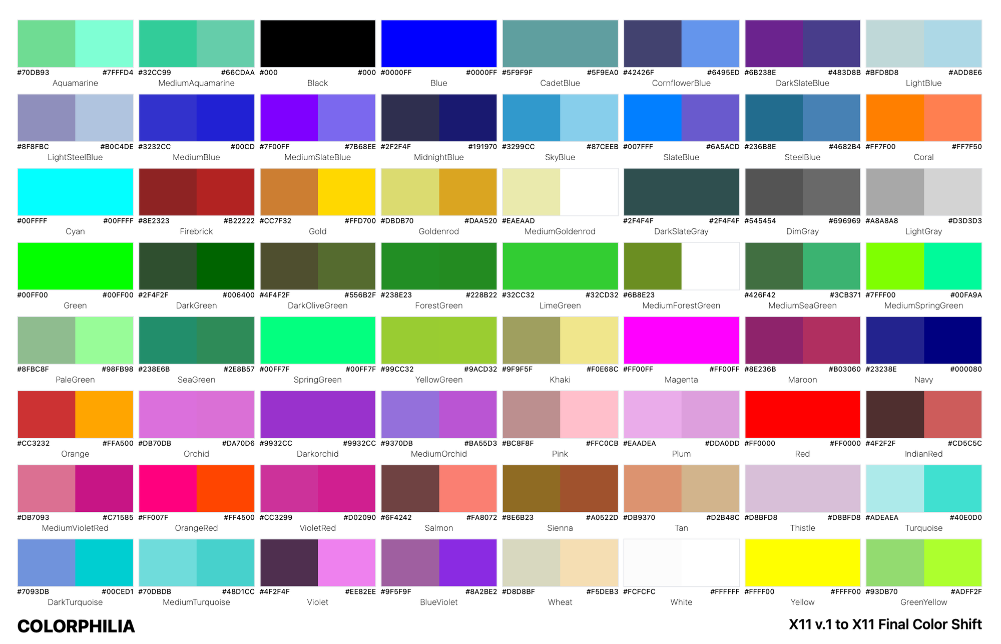
I converted all the HLS colors to their RGB equivalents, and then mapped the colors as they were were when they were borrowed from the VT-240, and then how the X11 adjusted those hues, before SGI would borrow the colors from them.
And it was only when I was dealing the original HLS numbers did I notice several patterns.
Dark and Light
For the spectrum of light and dark, they simply chose 0° hue and 0% saturation, and took four shades of lightness, at 99% lightness (white), 66% lightness (light gray), 33% lightness (dim gray), and 0% lightness (black). The words "light" and "dim" are in reference to how they generated this list.
Half Bright, Bold Colors
The VT-240 team then created a basic palette of colors, by selecting every 30° hue on the 360° spectrum of color. You can start seeing how they had some difficulty in assigning color names.
I have absolutely no criticism of how the VT-240 named these colors. Having named several palettes of colors for various projects, I know how difficult it is.
The fact that they were doing this all on one of the first color monitors was very impressive. I don't know what exactly they saw, or why they would think that that an orange shade of red would be closer to magenta than yellow. Not judging.
But we can see elsewhere in the X11 list that instead of shifting the MediumSlateBlue more into the blue spectrum, they took the SlateBlue into the violet spectrum.
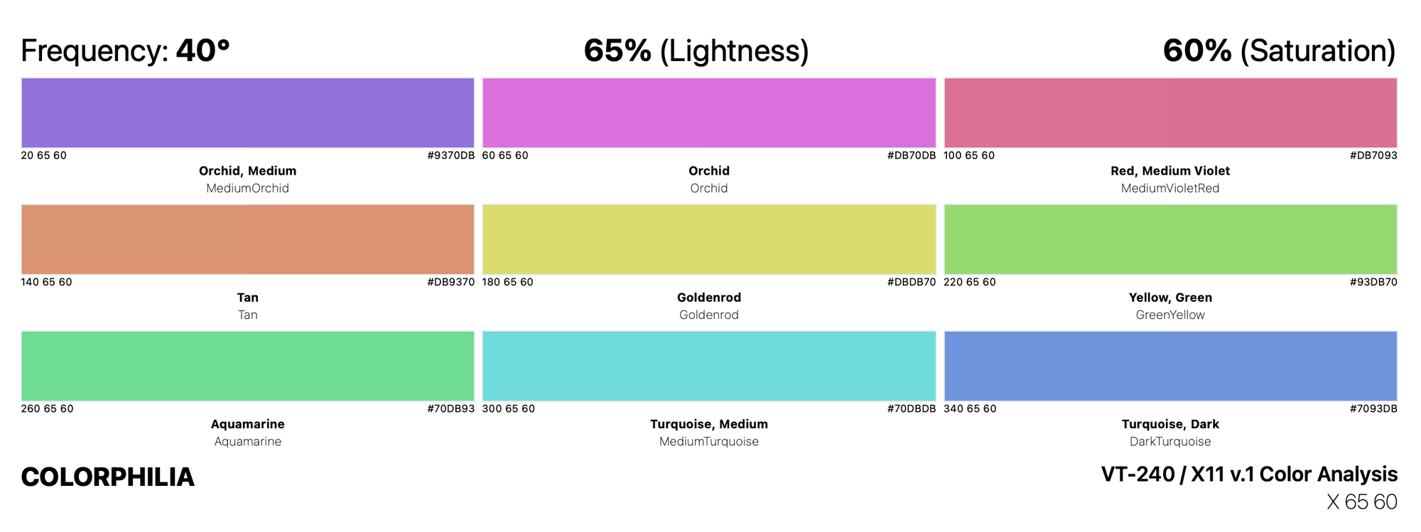
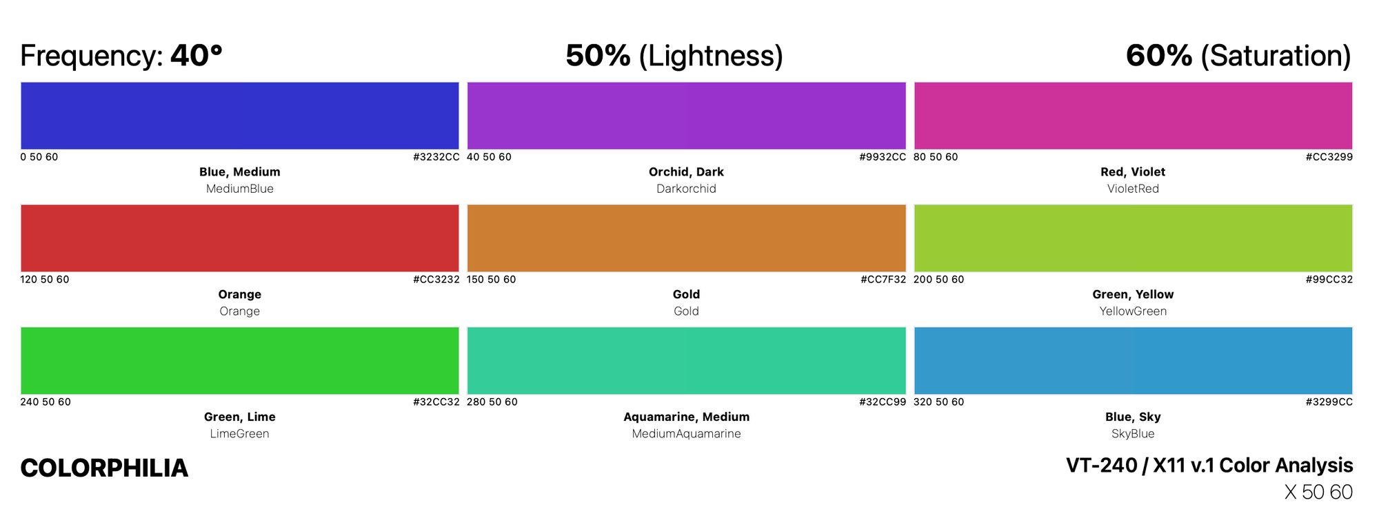
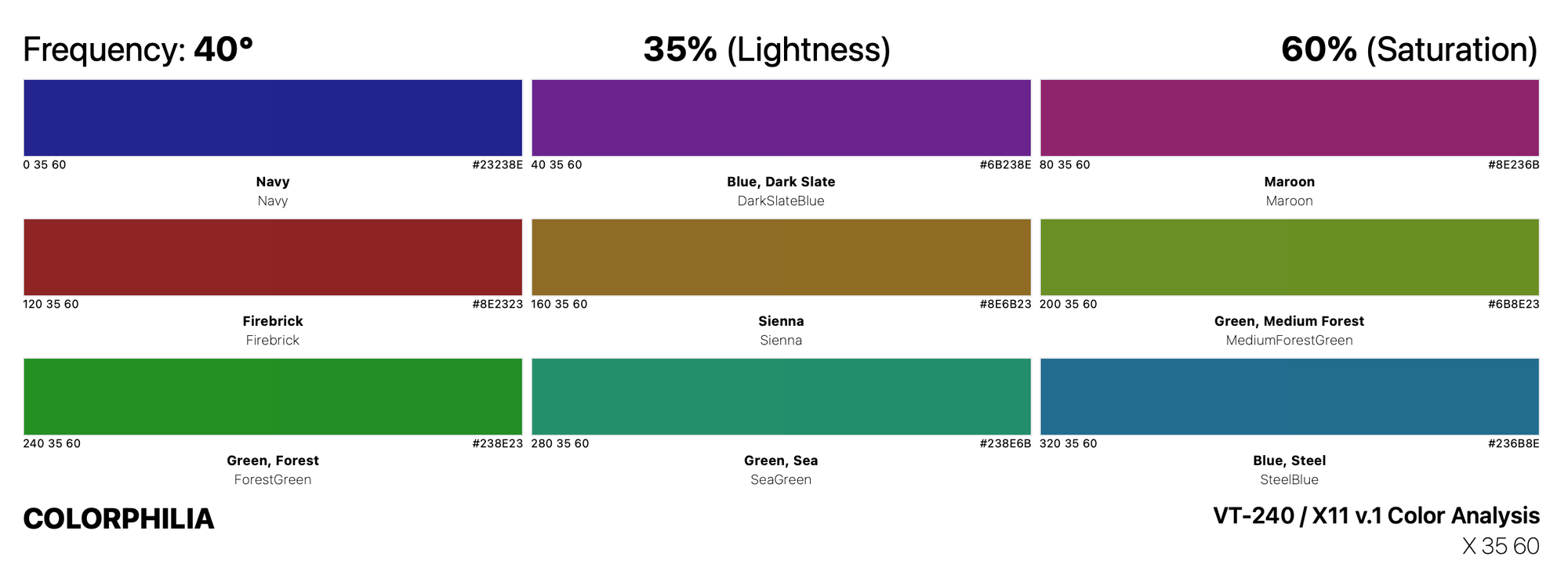
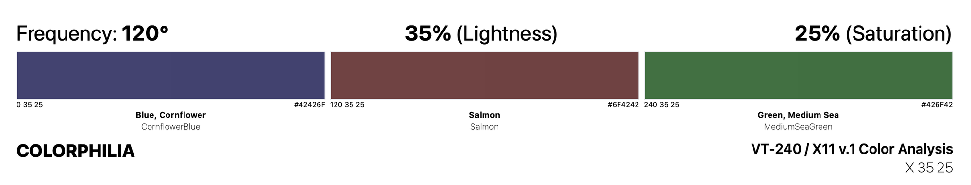
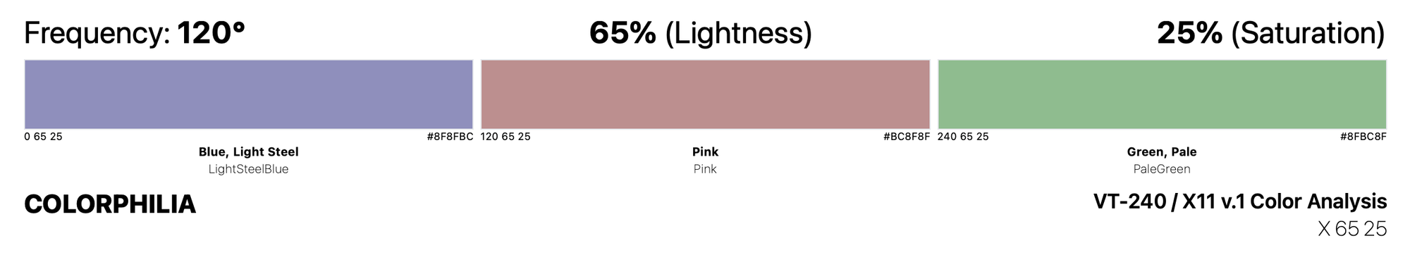
Some Saturated Light Play
They may have selected a 40° frequency between colors of the 60% saturation, but they chose to start the 65% lightness at 20° as opposed to the 35% and 50% palettes.
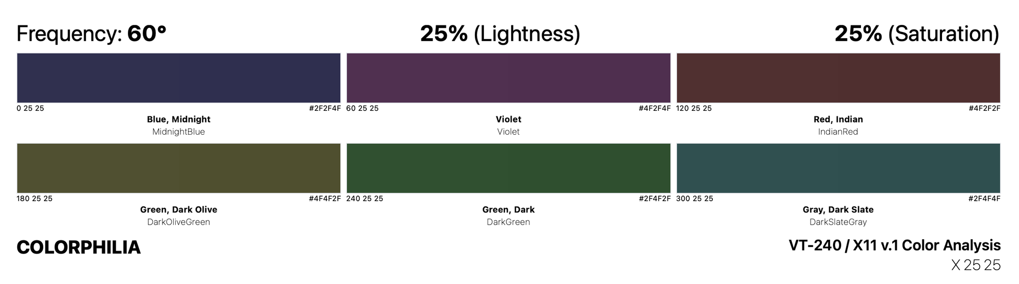
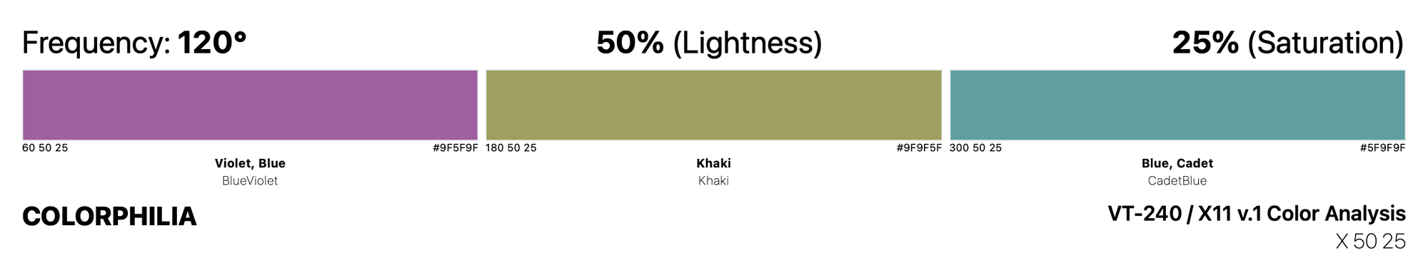
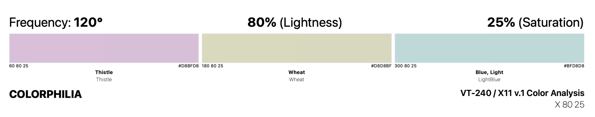
Unsaturated Play
Even in the low-saturated palettes, they began some at 0° and some at 60°. So this wasn't completely a technical decision, there were aesthetic reasons as well. And based on their metholodogy, I think it is very fair to say that they generate a nice, mathematically accurate, arrangment of colors.
The somewhat incorrect criticism that they "tend[ed] towards reds and greens at the expense of blues" is simply a misunderstanding of how the visual spectrum of light works. Green is naturally overrepresented on the 360° color wheel, and they did an admirable job to counteract that with their sampling methodologies.
Transforming the Borrowed List
Out of the 64 original colors borrowed from the VT-240 list, the X11 changed 53 of them. Additionally, two of the shades – MediumGoldenrod and MediumForestGreen – were not kept in the final list.
Between these 64 colors, the 22 colors borrowed from Sinclair colors, and the 16 HTML colors, we see the how roughly 70% of the SGI/Netscape colors were initially named. The vast majority of the rest were shades of these base colors, either using numbers or words like "medium", "pale", and "deep".
See also: purple, indigo, crimson, and hot pink.
Takeaway
My main takeaway from all my research about the origin of web colors is still that we should return indigo to its blue hue. Also, the entire process was very human and quite relatable.
As I wrote at the top of this newsletter, I'm composing short histories or provenances of each of the 140 colors included in the original list of CSS colors to remember their rich pre-web histories, while highlighting how the internet changed our relationship to color.
Please let me know if you would be interested in this.